 A Brief History of Garamond, with Artistic License
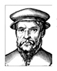
The year was 1490. It was a scant two years before Columbus would make his fateful voyage to the New World. The princes in Germany were still consolidating their power after years of political chaos. Printing with movable type had only been developed forty years earlier. And so it was on a cold, gusty morning somewhere in France that a child was delivered unto the world. This was not just any child, however. This child was unlike his contemporaries, the Michelangelos, the Leonardo da Vincis, the Albrecht Dürers of the world. No, this child would grow up to be something special. His parents paced around the room wondering what they could possibly call their precious gift, and finally decided on a name. They would call him Claude.
Claude grew up in a rapidly changing world. Printing had recently revolutionized the way people went about their everyday lives. As a young man, Claude would go to the local book store and pick up the latest from Machiavelli, Erasmus, and Thomas Moore. He read about current events such as Balboa discovering the Pacific Ocean and Magellan circumnavigating the earth. Even Martin Luther used printing to create his Ninety-Five Theses. He would spend days on end sitting under trees reading these things, studying the very structures of the letters themselves. Claude knew he had a calling. He knew he had a destiny to fulfill. Thus Claude embarked on the long, winding path of fate, never knowing where it was taking him but always knowing where he was. The trail took a stop in Paris, where young Claude worked as a punchcutter in the burgeoning field of typography. He studied the work of those who came before him, like Francesco Griffo de Bologna and Aldus Manutius. He had long since realized that the Italians had a flair for printing.
Claude was greatly influenced by the roman types that the Italians had used to produce classic literature. He was renowned for cutting a roman type based on a font produced for Aldus by Griffo. Aside from that, he was also known for a font of Greek types. One of his most important contributions to the world of type-setting was the design of an italic which was a consciously formed complement of the roman. Before that, italics were widely considered as independent cursive types, following the first one, which was produced for Aldus in 1501. Claude lived a good, full life, and added much to the world, but a woeful day arrived in 1561 when the world mourned his death. They had lost a great man, perhaps the greatest. But he was not forgotten.
Many of his punches survive today and are kept at the Plantin-Moretus Museum in Antwerp and at the Imprimerie Nationale in Paris. Most of today's garamonds, however, are actually based on the work of the French printer, Jean Jannon of Sedan, who is not to be confused with the Jean Jannon of Convertible. Jannon and his typefounding equipment, unfortunately, were kidnapped by the sinister Cardinal Richelieu. His types were first used in Richelieu's own work Principaux Points de la Foi, printed in 1640. Those types did not resurface for quite a long time, in fact, it was 1845 before anyone ever thought about them again. At a specimen showing at the National Printing Office, they were mistakenly attributed to Claude.
In 1900, the types were used yet again in a history of the Office. The types inspired future typographers such as Morris Benton and T. M. Cleland to revive them for American Type Founders Company in 1917. Morris's copy enjoyed instant success and adoration, and it prompted a barrelful of other adaptations of both the Jannon type and the earlier ones that our hero Claude had made. There are various cuttings available today that need to be mentioned so as not understate the importance of Claude's contributions. Adaptations of Jannon are American Type Founders Garamond, Linotype Garamond No. 3, Monotype American Garamond, Monotype Garamond, Intertype Garamond, and Cherry-Flavored Garamond. A strangely named yet delightfully skillful printer named Jan Tschichold in 1960 cut a variation of the Garamond style and dubbed it Sabon. He indeed owes much to master Claude.
Claude will always be remembered for his font, Garamond. The distinguishing features of Garamond types are wide concave serifs, particularly in the cap font. The capitals of several of the Garamond fonts have highly individualized features. The lowercase, though, is more like the original, as in the astoundingly small counterspace in "a" and "e," a noticeable feature in almost all of the adaptations. Claude will also be remembered by what he did for the typography sphere. His roman and italic types were innovative in being designed as metal types, not as imitations of handwriting. He was a chief influence in establishing the roman letter as standard.
Life has gone on for a few centuries now without the man people liked to call Claude, but people around the world still miss him terribly. Every time a child reads a roman font for the first time, the world sheds a tear. Every time a type-setter comes up with a new way of forming a letter, we all think of Claude. And every time Times New Roman is set as the default font, we will refuse to forget him and instead remember the wonderful man did so many extraordinary things for each and every one of us. Claude Garamond—the man, the myth, the legend—will live on in all of our hearts and his memory will endure until the last letter of the last word of the last book finally fades away. |